Underwater photo editor tutorial
Everything the editor can do, panel by panel, with screenshots of the actual interface. If you only read one section, make it the neutral point: it is the single control that changes the most.
Contents
1 · Uploading a photo
Drag a file onto the drop area or click it to browse. The editor accepts JPG, PNG, WEBP and the most common camera RAW formats: ARW, CR2, CR3, NEF, DNG, RAF, RW2 and ORF.
Nothing is uploaded. The file is read into your browser's memory, processed on your own device and discarded when you close the tab.
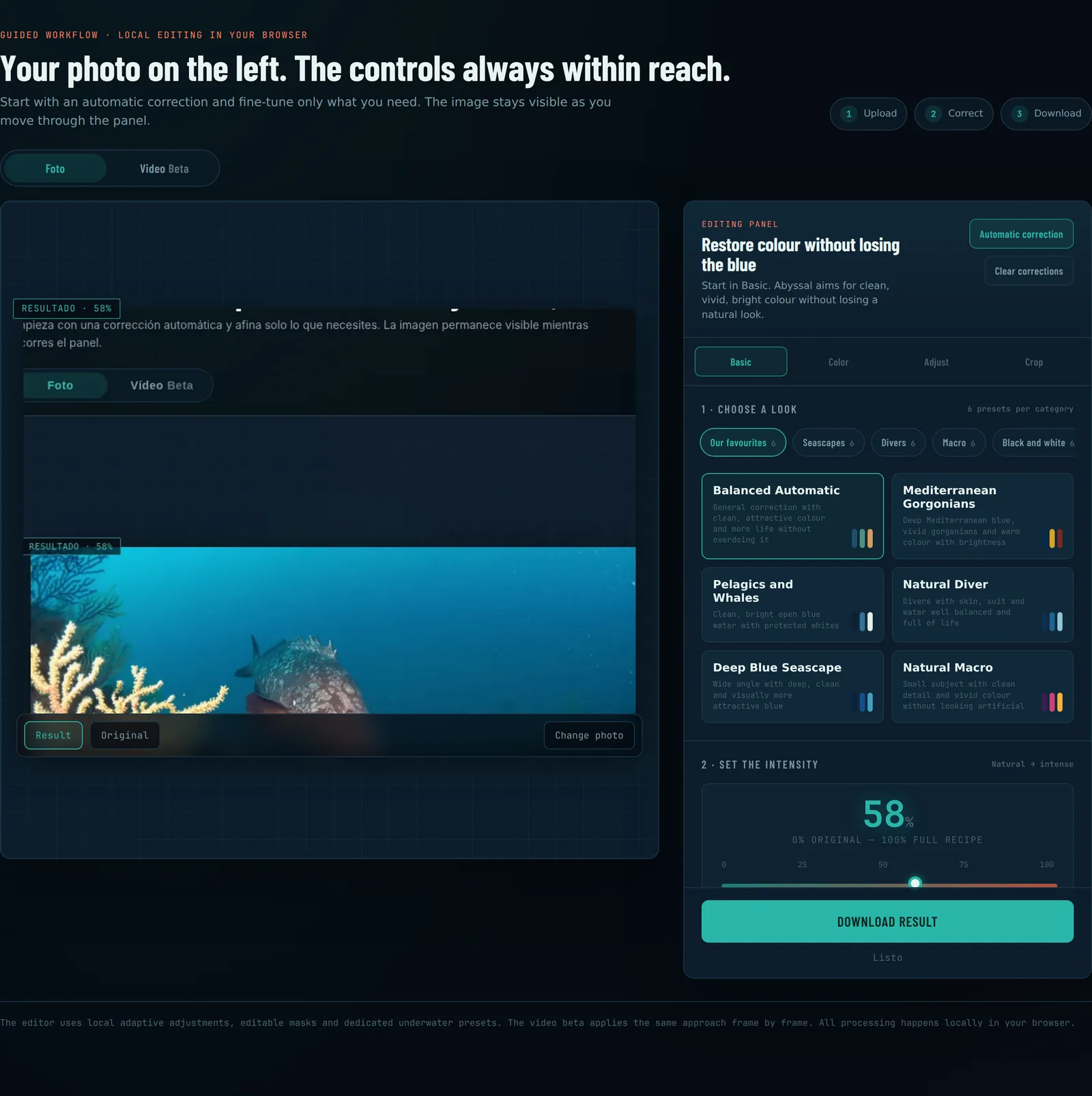
About RAW: the editor opens RAW files through the high-resolution JPEG preview your camera embeds in them. It is fast and completely local, but it is not 12 or 14-bit RAW development. For maximum recovery from a difficult file, a desktop developer still wins.
2 · Preset categories
There are 31 presets organised into six categories. Rather than scrolling one long list, pick the category that matches your scene and you will only see the six looks that make sense for it.
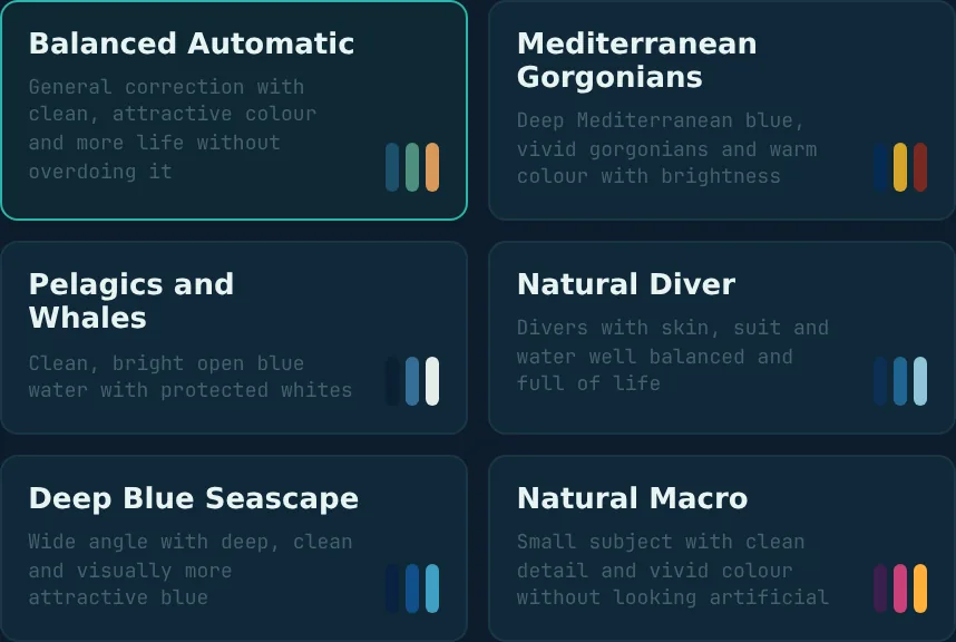
Start with Our favourites if you are not sure. It contains one preset from each family, which is usually enough to find the right direction in a couple of clicks.
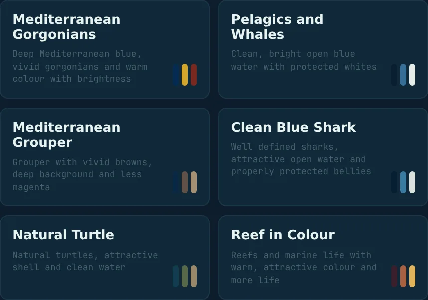
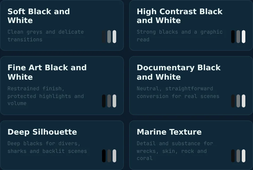
3 · Preset intensity
This is the most underused control in the whole editor. The slider blends between your original photo at 0% and the full preset recipe at 100%.
Most photos look better between 60 and 80% than at 100%. If a preset feels slightly too strong, do not go looking for another one: lower the intensity first.
4 · The Basic panel
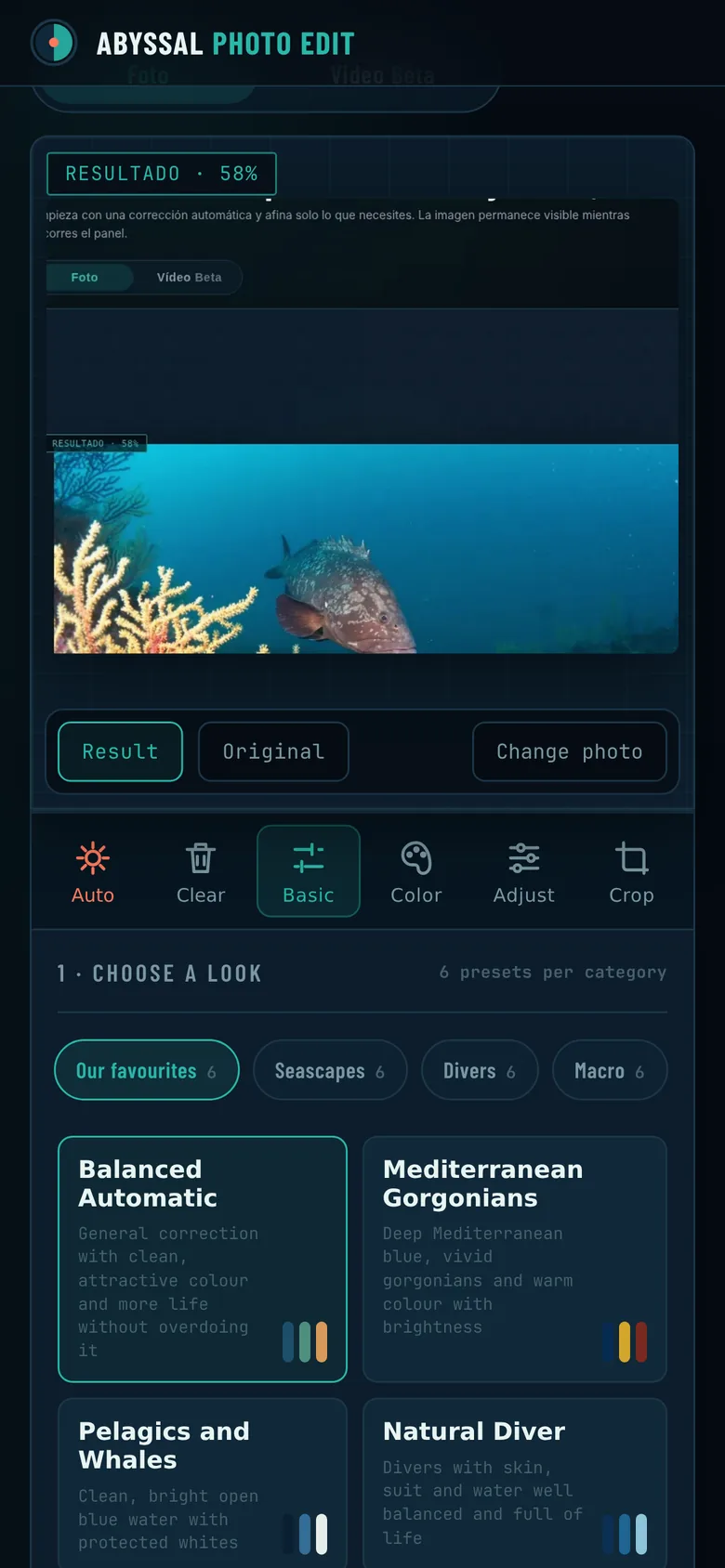
Exposure, contrast, temperature, tint, saturation, blacks and sharpening. If you only touch one thing after choosing a preset, make it exposure.
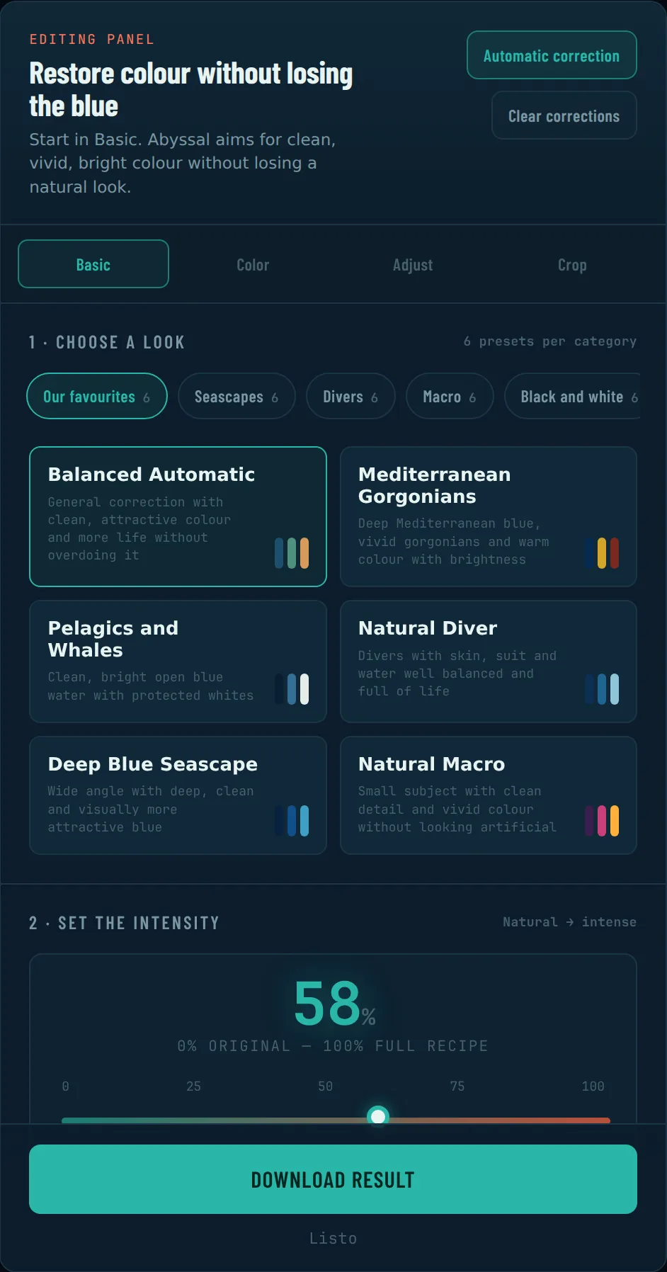
There is also Automatic correction, which measures the image and calculates what it needs rather than applying fixed values, and Clear corrections, which returns the photo to its original state without unloading it.
5 · The neutral point
The single most effective control. You tell the editor which part of the photo should have been neutral grey or white, and it rebalances every channel from there.
When you activate it a magnifier appears with a crosshair, reading the average of a 5×5 pixel area so a single noisy pixel cannot throw the whole correction off.
Good references: light sand, a pale rock, a tank, a regulator, the white skirt of a mask, a slate.
Bad references: background water, plants, coral, animals, or anything with a colour of its own. The editor will warn you if the area you picked is too dark or too saturated to work as neutral.
6 · The Colour panel and selective colour
Selective colour lets you pick any colour in the photo and change only its hue, saturation or luminance, leaving everything else alone. Useful for lifting a yellow gorgonian without touching the blue behind it.
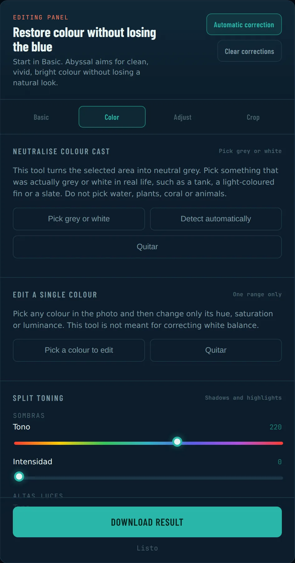
It is not a white balance tool. If the whole photo has a cast, fix it with the neutral point first and come here afterwards.
7 · Advanced: curves, histogram and split toning
The tone curve gives you direct control over shadows, midtones and highlights. The histogram above it shows where the information actually sits, which is the fastest way to spot clipped highlights before you export.
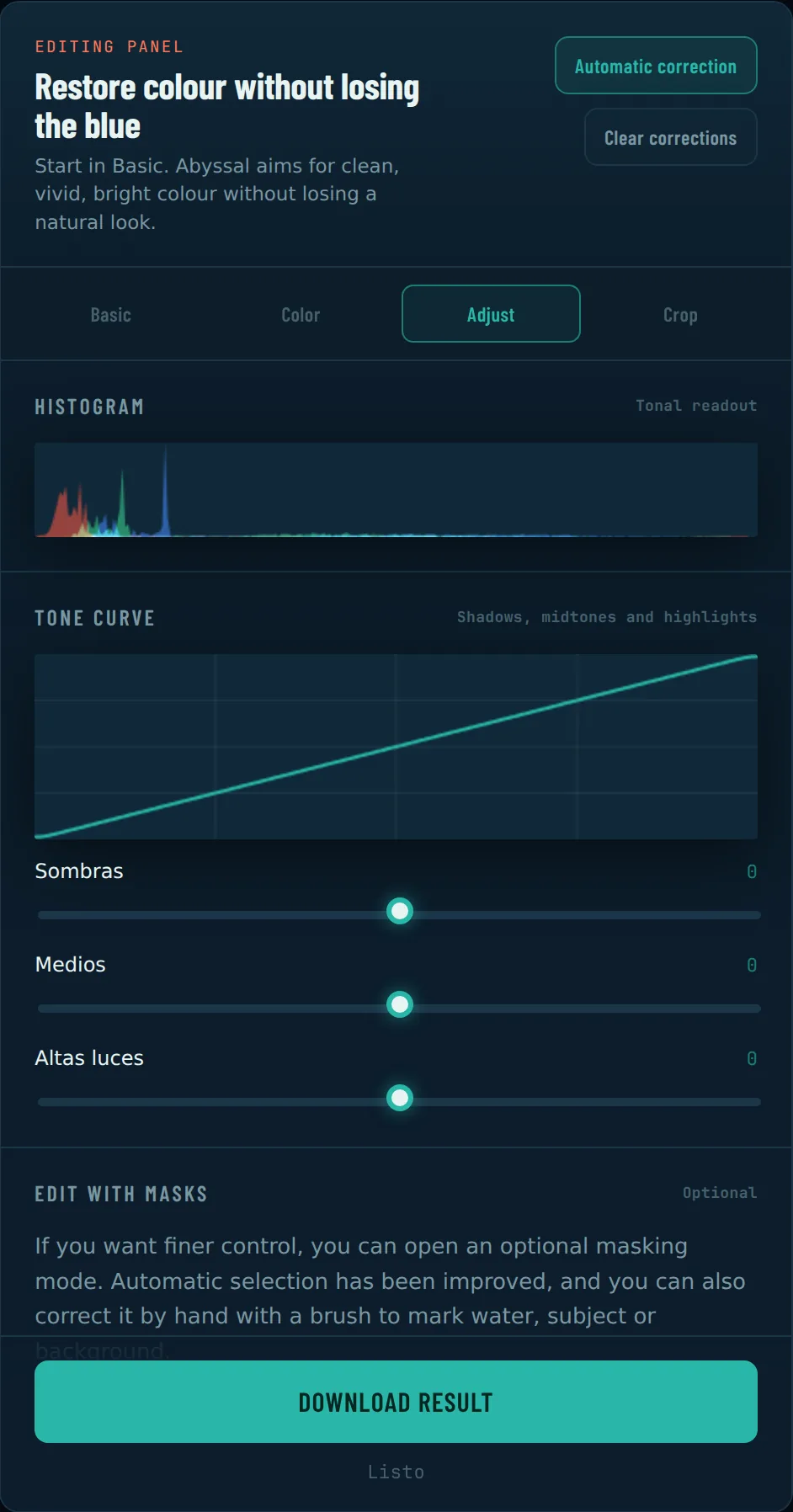
Split toning applies one tint to the shadows and another to the highlights. Used gently it adds depth; used heavily it is the fastest route to an unnatural image.
8 · Optional masks
Masks solve the central conflict of underwater photography: lifting the subject usually warms the water, and protecting the blue usually leaves the subject flat. Separating the two lets you treat them independently.
Selection is automatic, based on colour and position, and you can correct it by hand with a brush marking subject, background or water. While editing you will see an overlay: orange for subject, turquoise for background, dark blue for water.
Masks are optional. Plenty of photos never need them, but the difficult ones do.
9 · Cropping and downloading
Free crop plus 1:1, 4:5, 9:16 and 16:9 presets for feed, stories and reels.
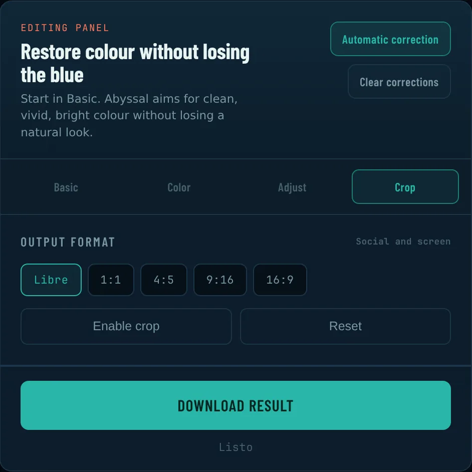
Use Result / Original to compare before downloading. Not to undo your work, but to recalibrate your eye: after twenty minutes with a photo, an excess of saturation starts to look normal.
Download exports JPG at 94% quality, with no watermark.
10 · Editing on mobile
The mobile layout follows one rule: the photo stays visible at all times. The viewer is fixed at the top and the controls live underneath, grouped into sections you reach from the bottom bar.
11 · Video editor (beta)
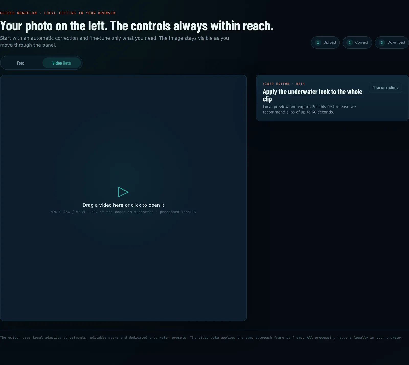
Switch to the Video tab to apply an underwater look to a whole clip. Preview is accelerated with WebGL, with a Canvas 2D fallback.
Worth knowing before you start:
- MP4 H.264 and WebM work best. Some MOV files recorded in HEVC cannot be opened by every browser.
- Export happens in real time, so a 60-second clip takes 60 seconds.
- Keep the tab visible while exporting. Browsers throttle background tabs, which can freeze or corrupt the output. The editor warns you if you switch away.
- The video engine is a simplification of the photo engine and does not reproduce every advanced tool.
12 · Common mistakes
| Mistake | How it looks | Fix |
|---|---|---|
| Preset always at 100% | Overcooked, uneven results across a set | Drop the intensity to 60–80% |
| Neutral point on water | Grey, washed-out image | Pick something that was really grey or white |
| Saturating before correcting | Garish blue, subject still flat | Colour first, saturation last |
| Sharpening everything | Particles and noise all over the background | Sharpen the subject only |
| Exporting without comparing | You only notice the excess days later | Toggle Result / Original before downloading |
Open the editor
Free, no watermark, no sign-up, no photo limit, and nothing leaves your device.
Start editingKeep reading
For the reasoning behind the workflow rather than the buttons, see how to properly edit a diving photo. The physics is in why underwater photos look blue, and the adjustment-by-adjustment detail is in the colour recovery guide.